|
|
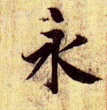
「永」字具中國書法之各種筆法之最佳字例,因此談中國書法筆法多以「永」字為例。惟楷、行、草各種筆法取向角度及結構因人而異,宜 (This
Chinese character "forever" contains all basic strokes. It is often adopted by |
Theories of Chinese Calligraphy
The
ancient calligraphers view the structure of a Chinese character as the “character's
posture 字
勢.”
They often referred to a calligrapher’s beautiful characters as flying dragon,
jumping tiger, clouds and sunset, and some other natural wonders. This section
of theory will discuss briefly strokes, postures, structures, and styles as inseparable
components of a good Chinese calligraphy style.
|
|
「永」字具中國書法之各種筆法之最佳字例,因此談中國書法筆法多以「永」字為例。惟楷、行、草各種筆法取向角度及結構因人而異,宜 (This
Chinese character "forever" contains all basic strokes. It is often adopted by |
Strokes
are the building blocks of a Chinese character’s structure. Character structures then
form a calligrapher’s style. If we compare a calligraphy style to a city’s
landscape, then the characters’ structures will be the
buildings' curb appeal while the strokes will be the interior design of a building.
Traditional
aesthetic theory has valuated individual brush strokes according to four
qualities, which should be perfectly balanced in a flawless writing:
Bone:
It exemplifies strength in the strokes so it appears impossible to break
them.
Flesh:
A well-nourished quality in the strokes without self-indulgence or fatness.
Muscle:
The appearance of one stroke being joined to the next by invisible or
visible ligaments, and also one character to the next.
Blood:
A full texture in the ink which should resemble neither water nor sludge.
Perfect density and shades of ink bring blood and life to a character.
|
各線性成分在書法視覺上含意如何?
直:直率、肯定、樸實、剛直。 7.濃淡:具墨色上氣韻變化之妙。濃的線條比喻接近,淡的線條比喻遠離,二者互有前後變化感。 |
Once
the strokes are established appropriately for a character’s structural design,
every stroke is enlivened. Since Zhong
Yao (151-231) and Wang Hsi-Chih, the norms of creating a structure in Kai
Shu had been set. As Chinese
Since
Zhong Yao and Wang Hsi-Chih, no matter how Kai Shu changed and new styles were
invented, the norms set by Zhong and Wang were not violated in most cases. For
every founder of a new calligraphy style in each dynasty, they were not only great
artists – they were also wise men with broad range of knowledge and life
experiences. Some were scholars, politicians, officials, musicians, generals, or
martial artists. Their insights to creating the structures of characters brought
new life to Chinese calligraphy.
The founding principles of a character’s structure can be analyzed into the following characteristics:
Stableness
Strength
Unbreakable
Beauty
Symmetry (especially for Zuan Style)
All the five major styles of calligraphy follow those principles. For Zuan Style, symmetry is also required. To design a new style of structure is not an easy task. It requires artistic insights and inspirations. The structural design is also closely related to operation and disposition of strokes, spacing, rhythm, and etc.
|
如果細細品味歷代法書,我們會發現那些富奇趣的空間呈現,往往不是制式的、完全先設想好的、一成不變的,而是每個書家在書寫經驗中養成了一定的審美趣味,學習、發展了自己一套書寫的法則而形成的。例如柳公權的書法中宮緊縮、虞世南舒朗勻稱、歐字險絕、東坡濃密、黃庭堅的幅射特性、八大的簡潔空靈等等。歷代書家已經有一套屬于他們的表達方式,呈現出來的畫面也就各富奇趣。
從這個角度思考,計白當黑就不單只是結構與布局單方面的問題,它與用筆、用墨息息相關。書家對線條特質、墨色、空間的理解越深刻,就越能在自然的書寫中黑白自成呼應,形成空間完美、引人入勝的畫面。
|
.jpg)