|
Version A |
Version B |
A6: How to Distinguish Authentic and Fake Chinese Calligraphy Works
Chinese
people impose very strict standards for good Chinese calligraphy. The following are
illustrations of the works with explanations to judge whether a version of
Chinese calligraphy rubbing is more authentic or nearly fake. In this section,
no contemporary works are listed. If we can tell the differences between versions
of masterpieces or rubbings ( 拓本
), we can surely recognize the quality of any Chinese calligraphy works
and maybe judge their authenticity. (This section also helps to understand the “copyright”
issue of Chinese calligraphy.)
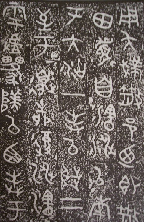
Zuan Style (Example 1)
|
Version A |
Version B |
The
rubbings from ancient masterpieces are usually cut and pasted to fit to the size
of a book's page. They are usually rearranged by the collector or publisher.
Versions A and B of “San Shu Pan
散氏盤
” look
different in the way a line (column) of characters are rearranged in order. It’s
necessary to gaze at the
original picture of San Shu Pan before we start the Lin Mo
practice. The original size in it’s entirety will not usually fit in our
books.
Despite of their rearrangement differences, (A) looks more thick and solid while (B) looks more bony and dry yet condensed in essence. This is due to the artisans' preferences of rubbing. Perhaps one might consider that (B) is stronger while (A) looks sloppy. In terms of Lin Mo, (B) will demand a higher level of skill and mind concentration.
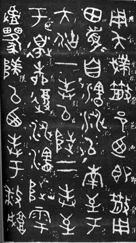
Zuan Style (Example 2)
|
Version A |
Version B |
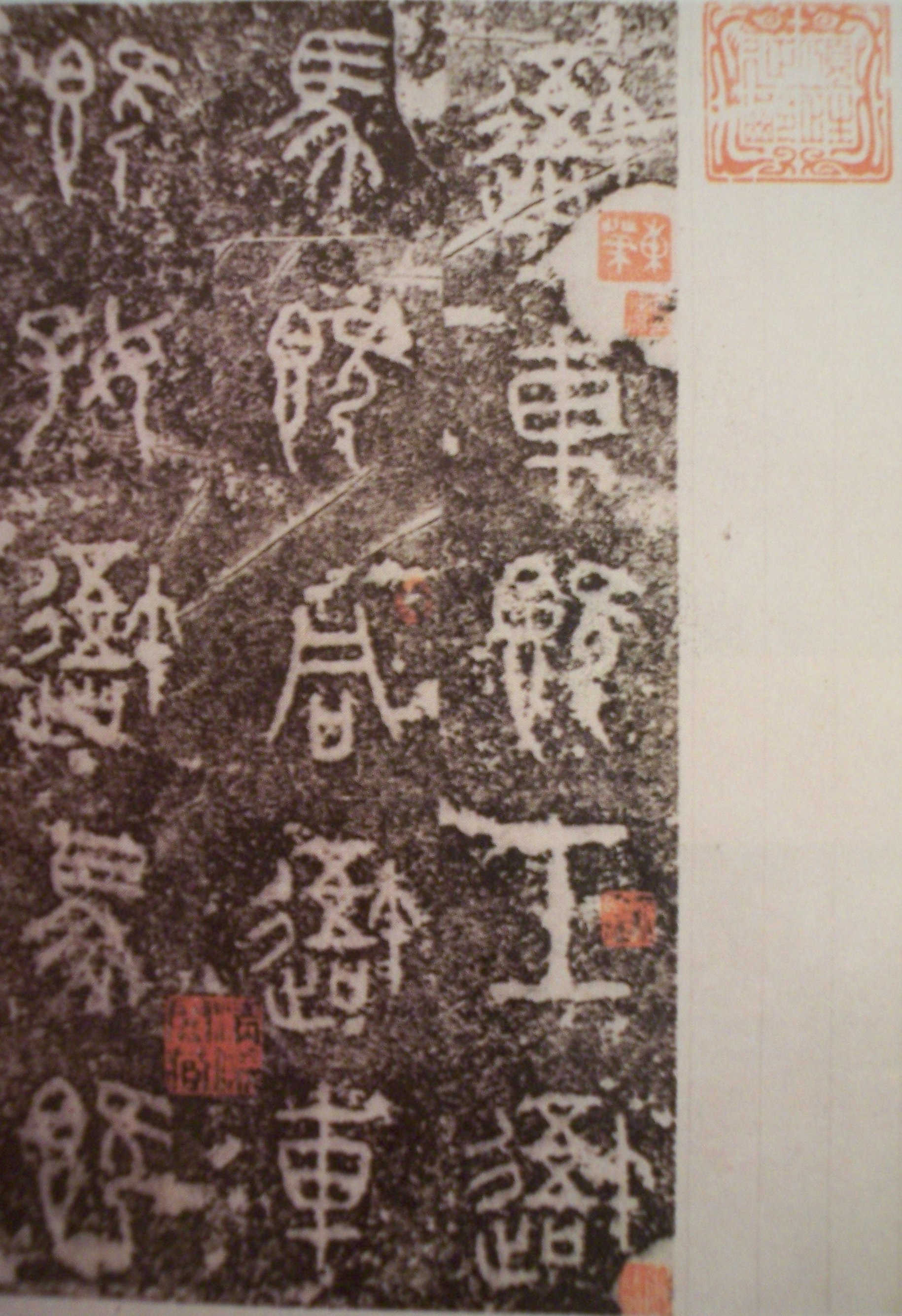
Li Style (Example 1)
|
Version A |
Version B |
Version C |
The
essence and spirit of the strokes are different in all three versions. Which is
more original? (C) is a cheap version that is printed with enlarged size for the
characters while (A) and (B) are original sizes. However, the spirit of (B) and
(C) is closer compared with (A) and (B) together. A publisher of (C) might have
bought (B) and printed it cheaply for sale. But (B) and (C) also have lots of
dissimilarities. We may doubt (C) was purposely “altered” and “amended.”
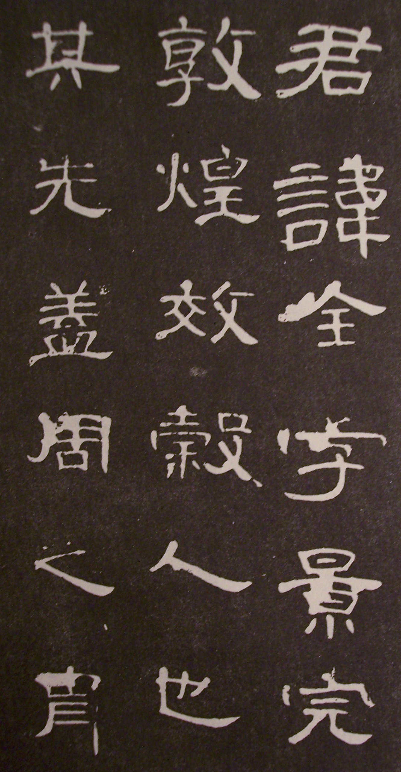
Li Style (Example 2)
|
Version A |
Version B |
Version C |
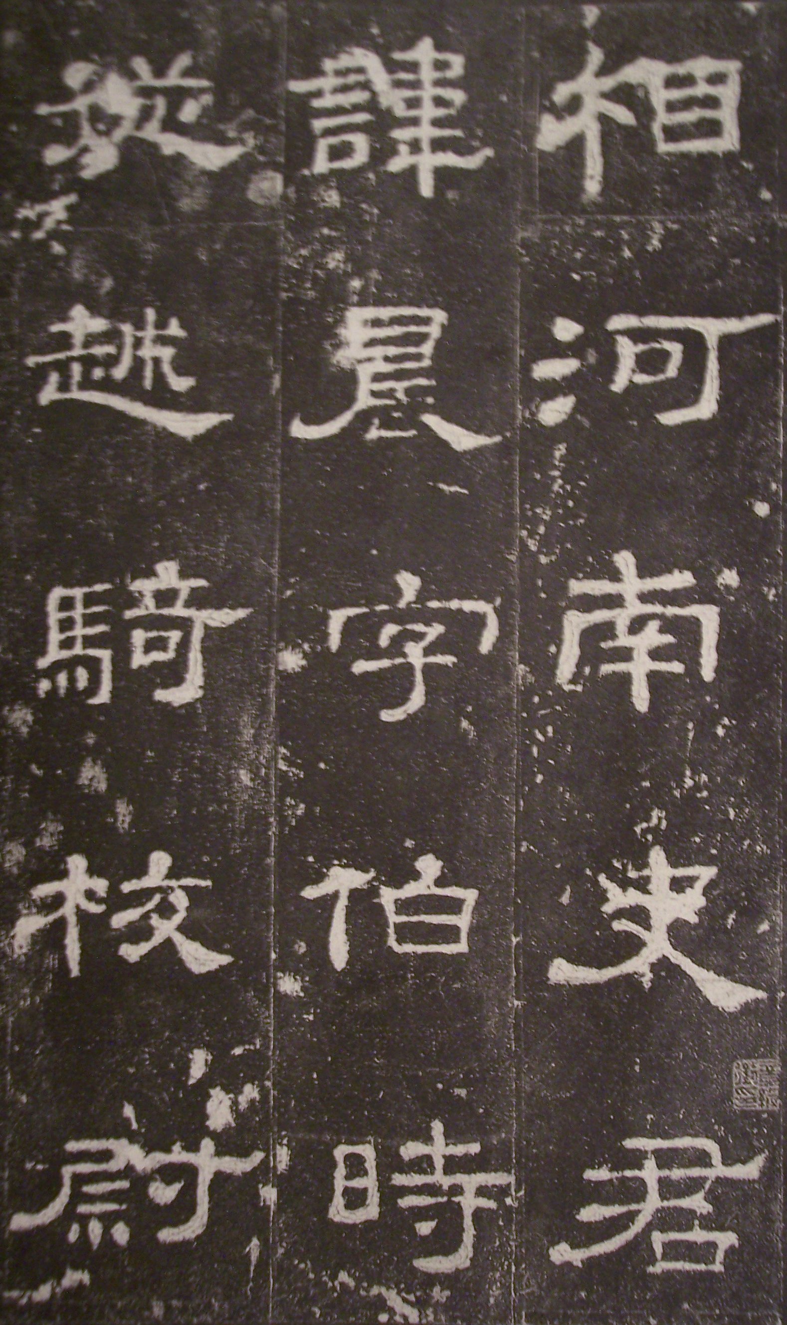
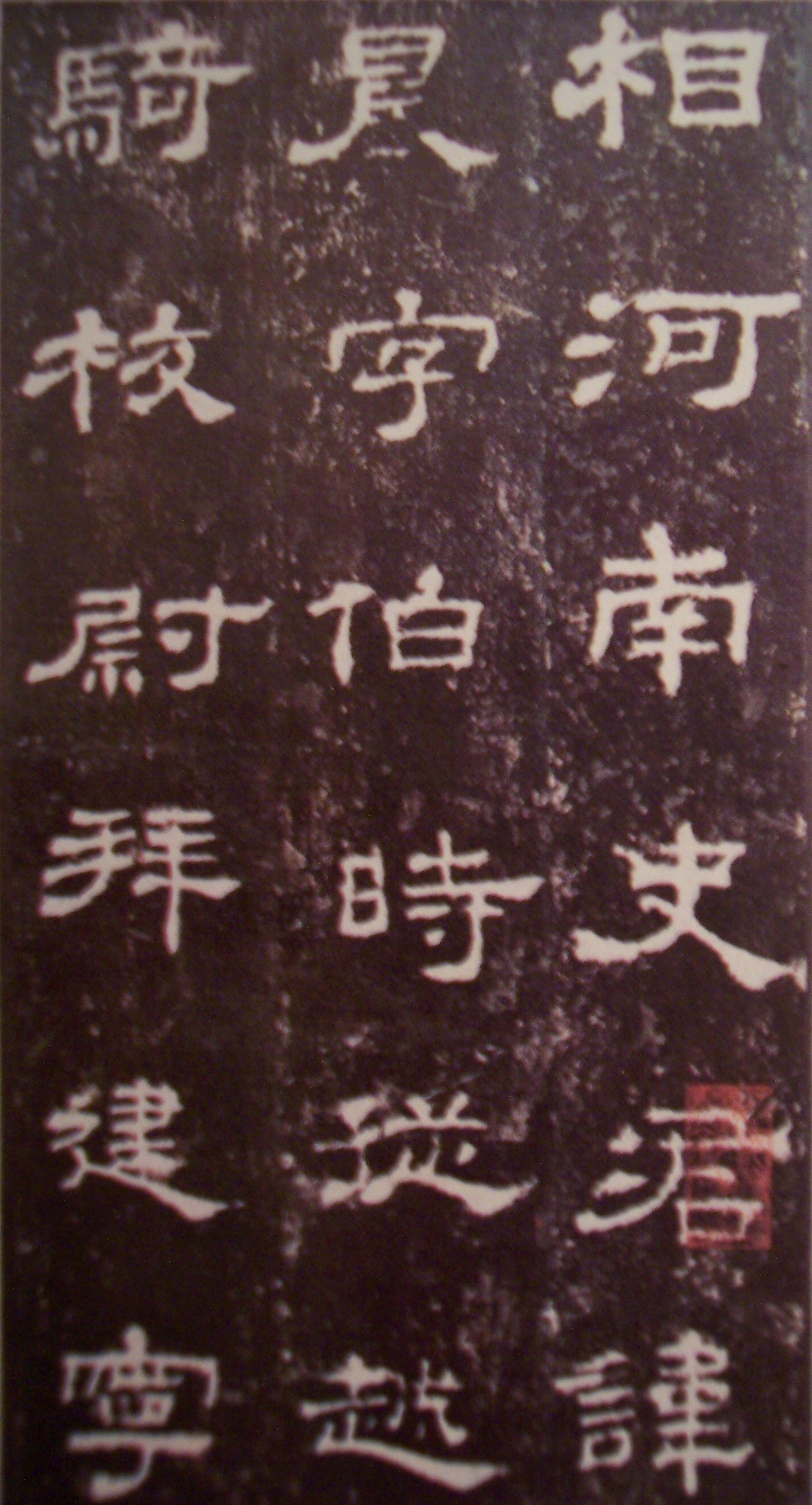
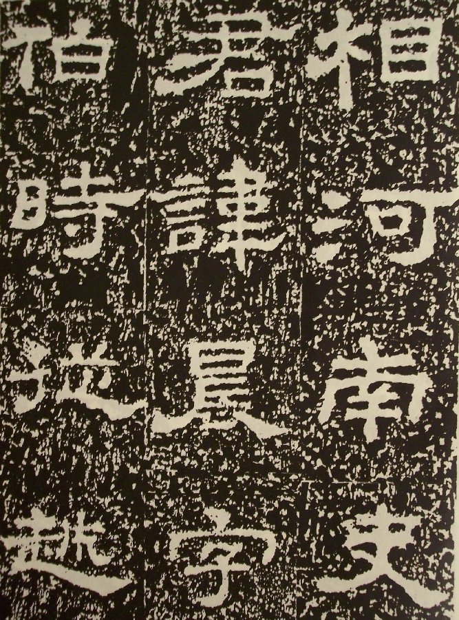
(A)
is a rubbing from the “fragmented” Tsao Chuan Tablet ( 曹全碑 ) . (B) was done before the tablet was fragmented. Both (A) and (B) have
collectors’ stamps for creditability. (C) is a cheap reprint from an unknown
source. However, the fifth character ( 景 )
in the first column corresponds in (A) and (C). It was ruined in the middle of
that character. This gives a hint that (B) has that character purposely
“amended” or “restored” which might have twisted the original spirit.
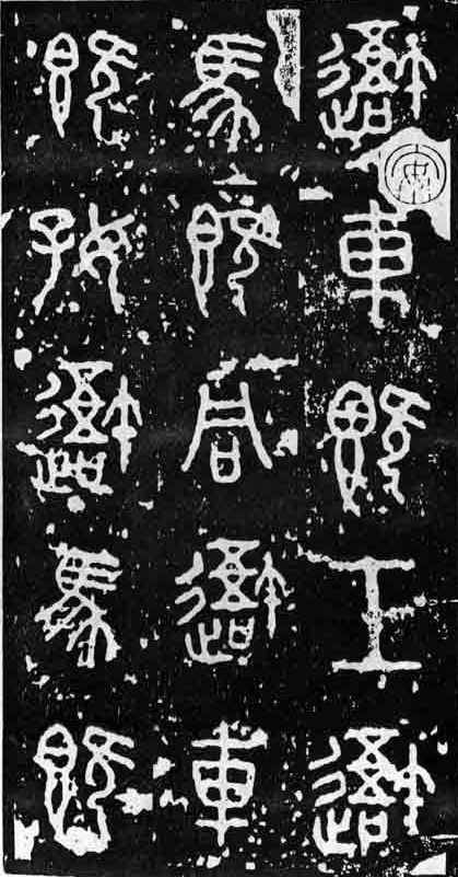
Tsao Style (Example 1)
|
Version A |
Version B |
The
strokes, postures, and spirit from (A) and (B) differ in every character. When
ancient Chinese could not preserve calligraphy on paper, they transferred onto
stones. The inscriptions eventually lost their original essence and spirit after
many times of remaking onto more stones. There was no photography or printing.
The more duplicates on stones were made, the more it became erroneous and
absurd. Missing characters from one version of stone to another are common.
Numerous rubbings from just one stone may also have great dissimilarities due
the artisans' rubbing techniques and personal preferences or biases. Here (A) has
three more characters in its last line than in the 4th line of (B).
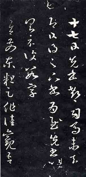
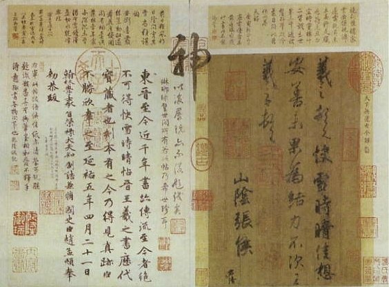
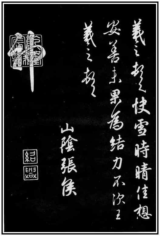
Hsin Tsao Style (Example 2)
|
Version A |
Version B |
This
is one of Wang Hsi-Chih’s most famous works.
The duplicate on stone as shown in (B) looks artificial and stagnant. The
nuances of ink densities on paper can never be captured and transferred onto the stone.
Even though (A) looks superb, flowing, elegant, and rhythmic, whether it’s
Wang Hsi-Chih’s original work remains controversial. Some scholars think (A)
was duplicated from the original in the Tang Dynasty. We may imagine Wang’s
level way, way higher than what we see today in museums.
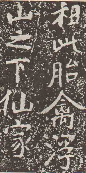
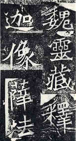
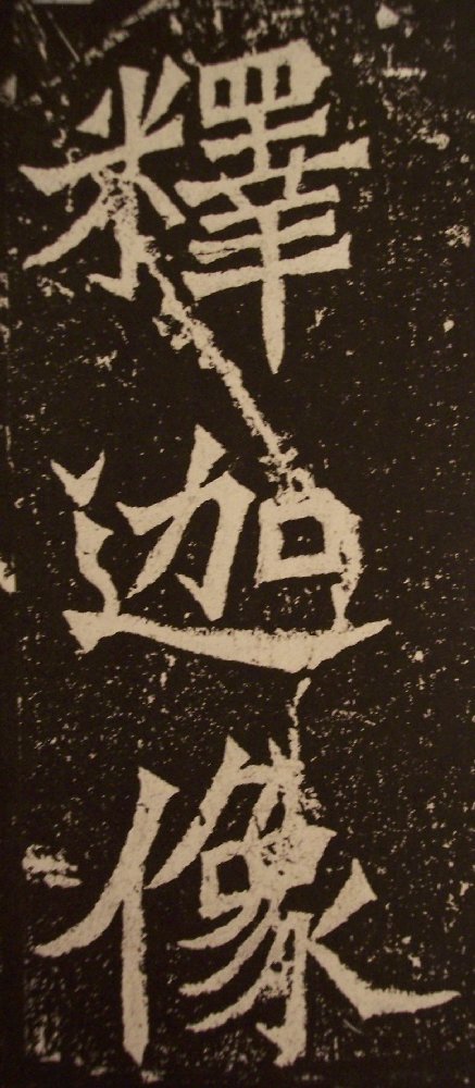
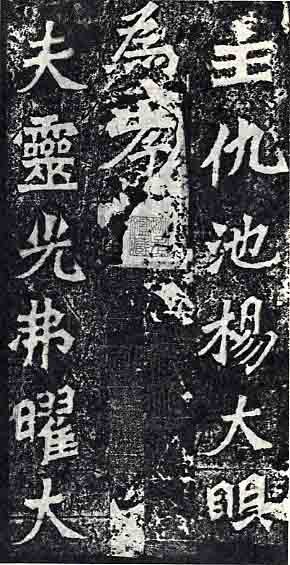
Kai Style (Example 1)
|
|
|
Version
(A) is generally considered the most authoritative rubbing of “Yi He
Ming 瘱鶴銘.”
The calligrapher of the monument, we believe, was a person who reached a high
level in metaphysics and spirituality. (B) is also a good version though we may
find dissimilarities among those two characters. Comparing the last “hook
鉤”
stroke of the two characters, the hook looks more sharp and smooth in (A) while
it looks stable in (B). Observing carefully these two versions or even the
original stone, we find it difficult to begin Lin Mo practice. If we try to
capture the appearance in (A), we lose “that essence” in (B) or in the
original tablet which is still in existence in China. A famous Buddhist saying is
“as you speak you make a mistake” (or “if you refer to one point, you miss
the others.”) This is especially true when we are emulating this model that is
encrypted with the calligrapher’s level and personality.
Kai Style (Example 2)
|
Version A |
Version B |
The
strokes in (A) look more delicate than in (B) due to the rubbing technique and
printing quality.
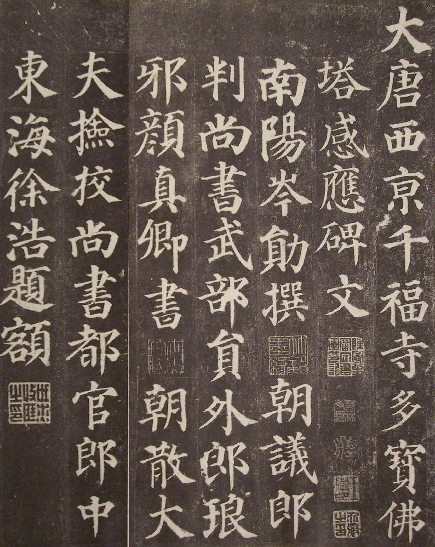
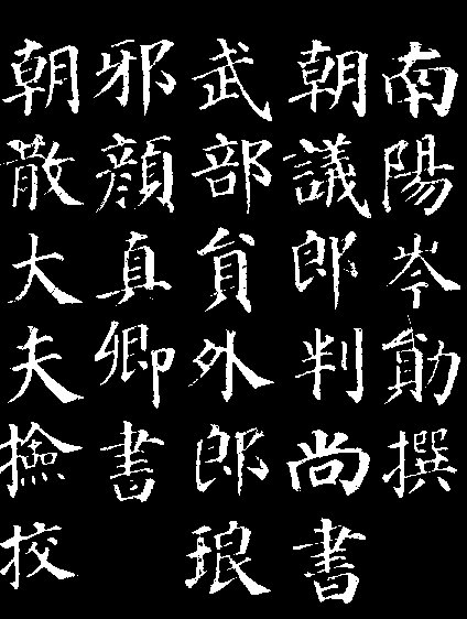
Kai Style (Example 3)
|
Version A |
Version B |
Notice
that there are some seal stamps in the middle of (A) that might add
creditability. (B) retains the missing or partial characters and “box” them
in the decipherment. The collectors of (A) just put seal stamps to cover or skip
those partially destroyed characters. (A) missed the first character as seen in
(B). Some strokes look more angular and sharp in some characters in (A) and some
other characters in (B).
Kai Style (Example 4)
|
Version A |
Version B |
(A)
is definitely a better version than (B). (B) is a cheap reprint without the
quality, seals, spirit, and original appearance. (B) is found typically in
bookstores or websites where beginners can find a Form Book to copy. Be aware
not choose this kind of low quality version.
In
fact, the rubbing artisans or the publishers often cut the rubbing into pieces
and rearrange them in different ways due to its inconvenient size of the
original stele or tablet. So when we examine several versions of rubbings, they
may look different in order and in the number of lines.
Just as the Bible has thousands of translations and versions, a Chinese calligraphy masterpiece can have many versions among museums, bookstores, and private collectors. Be sure to choose a few good versions for learning and comparison purposes and stay away from the bad ones that destroy the legacy of art. If we can tell the level of versions, it’s easy to judge a calligrapher’s level, quality, and honesty and even distinguish a fake duplicate or imitation from the original work.


.jpg)