A10: Common Notions
There
are many popular notions or misconceptions about Chinese calligraphy known to the general public. Even
most learned Chinese are preoccupied with some assumptions or misconceptions
about Chinese calligraphy whether the notions can be correct, incorrect,
appropriate, or inappropriate. Art is all about perceptions, feelings, and
esthetics; they are not textbook standards or statements, or associated with
one's educational degrees, social status, and political affiliations. After we have studied the works, theories, and
principles of ancient Chinese calligraphy masters, we may find the following
common notions or misconceptions widely held by most people.
| Size of Calligraphy | Write Neatly | Fast Writing |
| Content of Calligraphy | Clear Models | Life of A Brush |
| Seals & Signatures | Erasure | To Be Added |
Most
people think the larger the Chinese character’s size is, the better and more expensive
the work is.
Character
sizes around 3 x 3 inches are the easiest and most common. Characters as large
as 9 x 9 inches demand a higher level of skill and physical strength. Characters
smaller than 0.5 x 0.5 inches demand the highest level of precision in regard to
skills,
physical strength, and optimal personal well being. That's why Chinese
calligraphers specializing in Small Characters are very rare throughout each
dynasty. Just as
technique is the fundamental of art, precision is the soul of techniques.
A work of Small Characters demands the highest level of skill.
Many Chinese calligraphy practitioners often try to impress the average audience with super large writings. However, as long as delicacy, spirit, and strong will are embodied in each strokes, the size of writing is not a decisive factor to rate the work.
Some
people prefer writing to be neatly arranged, not scattered.
Ancient Chinese calligraphers did not write neatly inside grids. They did the art with a natural and peaceful mind. The work was not to be confined or measured. It is said that a student of Zhong Yao tried to write neatly in one size, then he was so scorned by his teacher that he dared not see him for three years.
It was until the time
(approximately the Tang Dynasty) when people began to use Chinese calligraphy as a means to gain positions of government
officers and be recognized by the judges in the civil service examinations that they began to write neatly or
inside grids. Some of those styles are called Guan
Ge Te ( 館閣體 ,
the monotonous court style of calligraphy
).
The
term 館閣體
refers to a "trend"
or a "temperament" of writing neatly and monotonously without spirit rather than
a major style or a sub
style of
Chinese calligraphy. 館閣體
look neat but lack spiritual and philosophical depth. They have never been seriously regarded by Chinese
calligraphers or scholars. Every character in "Guan
Ge Te" looks like
the same without obvious variations in size, expression, strokes, and writing speed.
The invention of 館閣體
was one of the starting points when Chinese calligraphy began to
fade in artistic levels! Today
if we don’t write neatly, we may not get a reward in most contests. People
eventually forget the original state of Nature and mind. There are no identical
leaves, trees, and mountains in Nature. And we just begin to separate ourselves
away from Nature!

The first and second works possess enormous beauty and more spirit while the third one looks more man-made and confined.
Modern
Chinese calligraphy contests usually require the contestants finish their works
in a limited time span. Most audiences will be astonished by a “fast”
calligrapher with a fluent and stunning speed in a public demonstration.
Our
eyes may deceive us. When we watch an airplane and a car moving, can our eyes
tell us which is moving faster? Time is relative, not absolute. It depends on
the observer’s position.
Not
only Chinese calligraphy adopts the importance of “slow practice” which is
quite contrary to the public notion. Carl Tausig, Franz Liszt’s favorite and number one student, would play every piece,
every note and detail very, very slowly again on the piano right after each
concert. He was such a brilliant pianist that his master and colleagues gave him
the highest compliments. It was said that until his death Tausig had no equal.
The Chinese internal martial artists also have a saying, “Slow
is fast!”
Every
masterpiece of the “Bei School 碑學”
stone rubbings shows us that the ancient calligrapher had gone through a lengthy
process of meditation and mental design. When they were commissioned to do a
great work for the emperors, scholars, or important events, they would go home
practicing again and again, contemplate for months, design and improve mentally
over and over until they reached their best level that are mostly unsurpassed by
later calligraphers in that particular style.
A
work produced after weeks or months of preparation looks more stable and rich in
spirit.
A
work done in a shorter time possessed less depth in spirit and essence.
This is why I do not have a fully commercialized website to sell my works promptly with features that the customers can choose "any" desired phrase, length, width, style, and fast delivery to fit in today’s Internet business. By doing this catering, I believe it’s against the legacy and spirit of Chinese calligraphy. I deeply appreciate those with their respect, understanding, and patience from the bottom of my heart.
The topic of speed in doing Chinese calligraphy is somewhat metaphysical, especially considering the mental design, Gee & Se, and many other physical, technical, and spiritual factors. It might not be understood from the speed or velocity as in physics or sciences. Science can never measure the "speed" and "quantity" of a mother's love. According to some Chinese calligraphers in our time, we agree the writing speed of the calligraphers in the Jin and Tang Dynasties (the golden eras of Chinese calligraphy) were moderate, not hurrying. It means that their speed was neither fast nor slow, could be either fast and slow, or anything in between, transcendental, or metaphysical. A mere bragging of one's ability to write certain number of Chinese characters per minute or per hour is evidently showing one's lack of real knowledge and skills of Chinese brush arts, where these may happen often among amateurs, beginners, and pedants who have read many Chinese calligraphy books from libraries.
People
want their desired content more than the artistic level in a Chinese calligraphy
work.
Most
Chinese and non-Chinese both prefer to choose something more meaningful to them
rather than the level of the art itself. It’s not right to ask people to
change their attitude of what they are looking for. What we can do here is to
enhance the public consciousness and knowledge of what a traditional and
authentic Chinese calligraphy work appears to be in terms of its artistic level.
Chinese calligraphy uses Chinese characters as its only medium of expression. Unless you also practice Chinese calligraphy, a viewer does not have to know Chinese to appreciate its beauty because Chinese calligraphy is an abstract art. When viewing Chinese calligraphy, one need not ask, "What do those Chinese writing mean?", "What is this style?" or even "Who did this?" In viewing a beautiful work, one does not necessarily ask or worry about "What is it?" Just relax and look at them for enjoyment and let the Art of Chinese Calligraphy sooth our mind, except that you are studying this art very seriously.
Most
Chinese poems and calligraphy masterpieces were articles that are not at all
related to our modern life. They
were written in Classical Chinese Style (Wen Yen Wen
文言文
)
and need to be deciphered or translated into Plain Conversation Style (Bai Hua Wen 白話文
).
Some of the calligraphy masterpieces were ancient and rare poems and they presented to us
the depth of beauty within. Most of the famous poets in ancient China were not
necessarily great calligraphers while most calligraphers’ poems were not very
well known compared to those of famous poets. However, the calligraphers wrote
their articles or letters according to the “genre” that best fitted into the realms of
Chinese calligraphy in terms of the selection and sequence of Chinese
characters. The ancient Chinese calligraphers and scholars did favor some
characters and used them frequently. They might have disliked some characters
and they rarely or never used in their writing or calligraphy. For example, in
ancient China, people wrote in classical Chinese. The English words
“you” or “thou” can be translated into “ 汝
”,
“ 爾
“ or ” 你.”
The ancient Chinese rarely wrote ” 你.”
And ancient calligraphers almost never wrote ”你“.
Instead, in classical Chinese it was usually written as “ 汝
”
and “ 爾
“ while ancient calligraphers mostly
favored “ 汝.”
Even though those three characters mean the same “you,” calligraphers
preferred “ 汝”
to ” 你
” for artistic reasons. If you have learned
Tsao Style, you will understand why.
Just
like a composer likes to use certain methods in counterpoint or harmony to
create a musical phrase, there are some methods or forms that some composers do
not like to use. A Beethoven piano sonata was to be played on the piano,
not meant to be played on the violin or by the symphony by the composer though
people have freedom for rearragenment. To some degree, Chinese calligraphy will
best fit in the genre of ancient Chinese articles or poems rather than any words
from commercial or political campaign in terms of artistic level and depth.
Most
beginners want to choose clearer, amended, "restored," or enhanced versions of
stone rubbings ( 拓本 ) instead of the earlier and original
ones that are faithfully rubbed, duplicated, and printed.
Most
beginners do not have an idea of what the original rubbings of ancient
characters look like. Some rubbings are so vague that is beyond reading.
Publishers thus amend or make up (they prefer to call "restore") clearer versions of rubbings to cater the
beginner’s mind and preference for convenience.
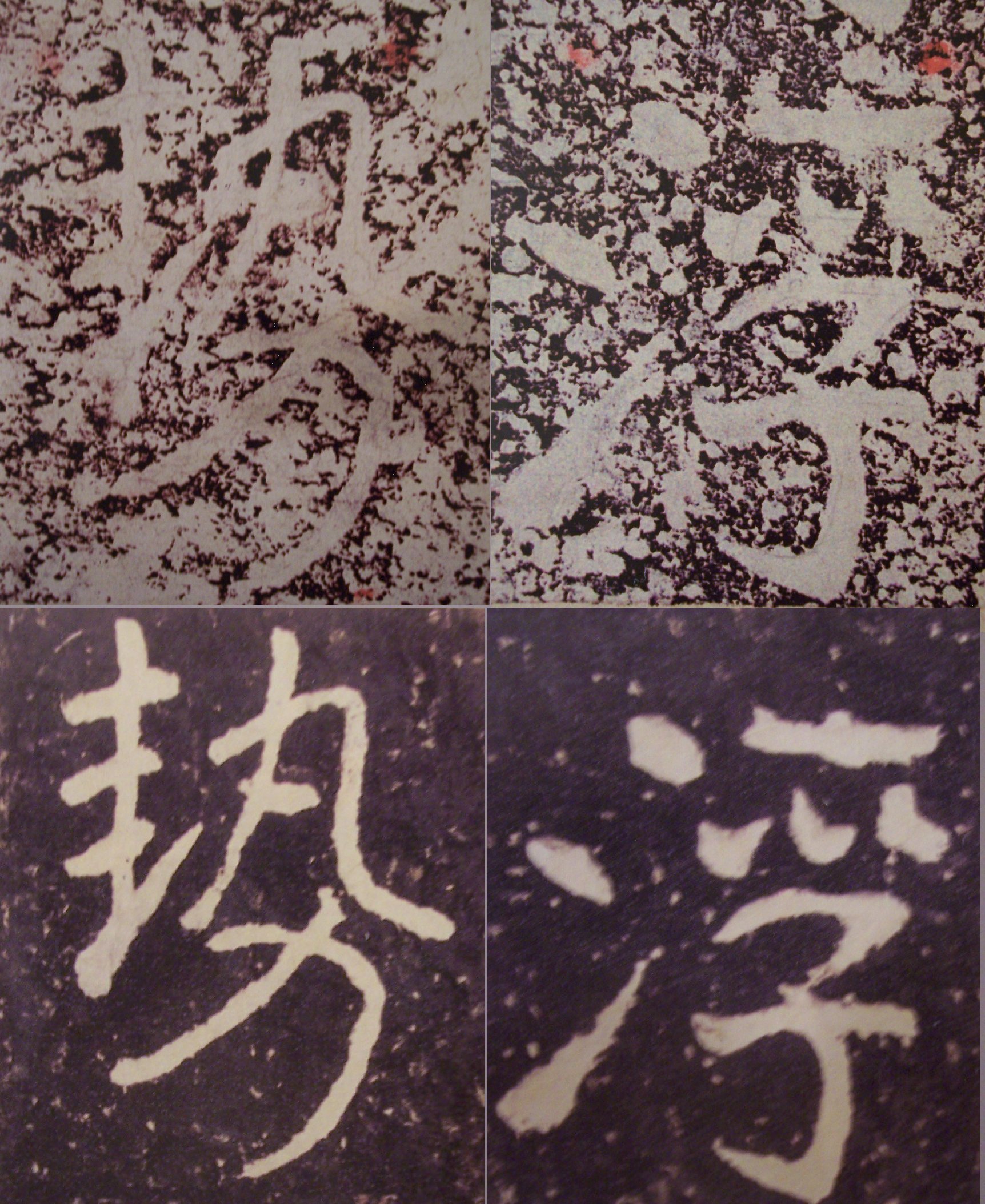
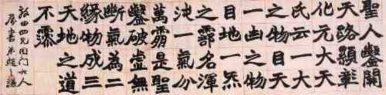
If
we look closely and examine the details in the bottom row of the above samples,
we will find nuances and details being changed by the publisher. The publishers
are not necessarily calligraphers. Even if they are, any amending in any kind,
no matter how small or nuanced, will destroy or distort the original spirit and probably the
positions, strokes, and thickness to some extent since Chinese and calligraphy
theorists consider Chinese calligraphy as "heart print" of "the
track of heart." Those "restored"
versions are merely camouflage. Even if you are just a
beginner or a non-Chinese, be sure to choose the original and earlier version
over the “clearer and amended” version. It’s permissible to buy both
“original” and “amended” versions for comparison. But only the
“original” version can be used for Lin Mo practice.
However,
if you are not a Chinese and just start learning Chinese language and/or
calligraphy, it’s okay for you to use this kind of “amended” or
“clearer” rubbings. As you have made more progress, it’s advisable that
you stay away from those versions and get the real and faithful ones.
Most
people assert that a brush will last for an average of few years, probably one
or two if you practice diligently. When I started
learning Chinese calligraphy, I practiced diligently with only one brush for one
style. I did not know how to take care of it by washing it properly. And of
course, I did not know any theories or principles of operating a brush. All I
knew were some basic rules my teacher taught me. So I ended up changing a brush
every year.
As
I grew up, I eventually began to have a better habit of writing. So it seemed
that my brushes lasted longer than when I was in grade school. And then in high
school when I became more devoted, I used only one "all-around" brush (Jian Hao 兼毫,
a combination brush)
to practice all styles I knew.
Then
as I read and knew more and more about the theories, operating principles, and styles, my
brushes I bought since 1990 are still in excellent conditions. None of them are short-lived again! (I do prefer some of them
and dislike some of them.) Since I know the proper operation and maintenance of
brushes, I no longer worry that they will wear out soon. I do believe they will
last lifetime or at least decades. Even though some of them are wearing out at
the tip a little bit due to frequent practice, I can still use those as featured
brushes to write other styles with a desirable effect or explore and experiment
different possibilities such as the textures in brush painting.
Unless a brush is made low grade, I will say a brush should last lifetime if we know how to respect it and apply the Center Tip Principle ( 中鋒 ). I suggest washing every time right after every practice – gently and respectfully.
Some people think that a Chinese calligraphy or painting work
should be signed and stamped with seals, at least to prevent future holders to
sign it.
The writing of a Chinese calligraphy work is the "main
content" of the work itself. The signatures and seals personalize the work.
Mounting ( 裝裱 ) is for display and preservation purposes. According to the
perspectives of Chinese culture such as 主次分明, we may think
of the main calligraphy content as the host, the signature and seals as the
guests, and the frame or the mounted scroll as a hall or a house. A perfect
party will consist a noble host, decent guests, and a majestic hall. A good
Chinese calligraphy work will be more valuable if it can meet the above three
conditions.
However, the main content is the most important and the signature
and seals are the most critical. We may consider having an outdoor party with
good programs, the host, and visitors without staying in a building. But if we
invite vulgar guests to the party, the main event will be totally ruined. It's
recommended that a good Chinese calligraphy work be framed or mounted according
to the Chinese notion of 佛要金裝,人要衣裝. If the frame
or the mounted scroll is poor or vulgar, it will totally devalue the entire work
no matter how great the calligraphy and seals are. If the mounting and (or) the
seals exceed the main content in artistic levels, they will add more value to
the calligraphy. However, if either the mounting or the seals are not good
enough to match the calligraphy's level, that work will absolutely be demeaned. This
is why famous calligrapainting masters always have a good business relationship
with professional and reliable mounters ( 裝裱師傅 ) and seal
carvers, or they have learned to mount calligrapainting and carve seals
themselves.
Similarly, if a Chinese painting work contains a poem written in
nice calligraphy and is stamped with nice seals, it's the perfect combination of
Chinese calligraphy, painting, seals, and literature. (That's one of the reasons
why Chinese calligraphy, painting, and seal making are sister arts.) But if any
one of the three add-ons (calligraphy, seal, or poem) is below the painter's
level a lot, it will ruin the whole work no matter how great the painting is!
In early dynasties like Han, calligraphers did not care so much
about personalizing their works. In fact, many of the best ancient masterpieces
remained anonymous. The original artists realized the cosmic harmony existed in
the nature and many things were not created or personally owned by the artists
individually. They cared for the level of art more than personal
recognition. This great philosophy is different from modern and Western way of
signing and personalizing an artwork. I was once asked by people who do not know
Chinese culture, philosophy, and calligraphy about leaving a Chinese painting or
calligraphy work unsigned or anonymous. They doubt that if a Chinese painter or
calligrapher does not sign his / her work, later it may be possessed by someone
who signs it and sell for higher prices! (What a joke and honor! Once when a
famous Chinese painter found out there were more forgeries of his work in
the market than his real work he painted himself, he said, "it's plausible
to create fake imitations or duplicates of a deceased master, but I am still
alive!" ) That "someone" must possess at least the same artistic
(calligraphic) and moral levels of the original artist in order to sign a
painting or calligraphy work without totally destroying its value.
"Someone" who has reached a high level, of course, need not sign
other's works - they can create their own good works! So if a Chinese painting
or calligraphy work is good and anonymous, the original artist may have realized
the ancient philosophy of "Not Possessing" even though it may not be
compatible with today's business concepts.
|
The following articles are not written
by Joshua; I did not make those rules. Nor does anyone have authority to
dictate those rules or norms to everyone who does Chinese calligraphy
and painting. IMHO and according to my other art friends' opinions,
these "summarized" norms and/or rules are meant to be observed
and deserve attentions, and better not to be violated (with certain
exceptions in some special situations) to invoke jokes or ridicules from
experts or connoisseurs of Chinese calligrapainting. The rules and norms are adapted from
Chinese books and various Internet sources. You may use Google Advanced
Search to find out how many Chinese Websites have articles containing
these norms or rules regarding using Chinese seals on Chinese
calligrapainting and how many English Websites talk about these norms
and/or rules. A good way to verify this is to search "一方形,一圓形,不可匹配" or other short Chinese phrases
in the following articles in Google Advanced Search. It is certainly
true that a native Chinese, whether practicing Chinese calligraphy and
painting or not, may not have heard those rules and norms during his
lifetime... This is analogous to that people in certain parts of the
world learning different languages may not be able to imagine the
differences of grammar or syntax between English, Russian, Chinese, and
other languages. What we have not heard or imagined does not mean
certain things do not exist.
A teacher talks about dating, signing and using seals according to traditional norms
A teacher talks about signing and using seals at the right locations of a work
Some paragraphs are translated into
English "literally" by me. To maintain objectivity, I have
tried to remain faithful to the original Chinese texts except correcting
some of the typos or changing punctuations to be more readable. If you are doing so-called Modern
Chinese Calligraphy or Modern Chinese Painting in innovative approaches
or Xieyi styles, you may or may not need to observe some or most of the
norms listed below. But if you are doing Chinese calligrapainting in
traditional approach or with classical spirit, you need to pay attention
to those rules; otherwise, experts and connoisseurs ( 鑒賞家 ) will ridicule your work if you unknowingly violate some of the
“general” (but not absolute) norms. Sometimes they just laugh in
their heart or smile without giving you any compliment - they remain
honest and polite, but not diligent – they don’t tell you
exactly which norms have not been observed, especially when it is not
possible to explain many topics in a short conversation.
|
|
印章的種類 Kinds of Seals 名章 (Name Seals) 名章泛指作者姓名、字號等代表作者身份的印章,用于作者落款之後。一幅作品有兩方以上名章時要有陰陽變化,且大小最好相近,間隔至少一個章的空位。名章有時也可作手章使用,因其意義比較嚴肅,固以方形為主。 關於姓名、字號的區別 A
list of Style Names and Studio Names of Chinese Painters 閑章 (Mood Seals, literally Leisure Seals) 閑章是為了豐富畫面、完善構圖而用的章。內容多為與作者的喜好、作品的內容有關的詞句或形象(如座右銘、作畫時間、作畫時的心情、作品的寓意等)。 Joshua’s
comments: The contents of the Mood Seals need match the contents of
calligrapainting work. You cannot paint a love scene with a man and a
woman dating in a beautiful landscape with relaxed and romantic mood
and then stamp Mood Seals that say something politically like “Fight
for your country with loyalty to the end of war” or “Destroy your
corrupt government with justice” or "Practice martial arts with
endurance and strong will." Many people today (not only beginners
or non-Chinese) eagerly want to show off their seals by stamping as
many as possible on their work without considering the factors listed
here. Redundancy, mismatches, impolite implications, and wrong
locations are the most commonly seen errors of using seals on Chinese
calligrapainting. Of all kinds of seals, Mood Seals are usually one of
the most abused seals on Chinese calligraphy and painting.
根據用印的位置又可將閑章分為三類
Mood Seals can be further
categorized into the following types according to the locations where
they are stamped on a work: 1.
引首章
(Leading Seals):用于作品的右上方,與落款相呼應,又與畫面融為一體,因此多以自然形為主。 If
you gift your calligrapainting to others and write the recipient’s
name on the top right corner, you may not stamp your Leading Seal
above the recipient’s name because this imply that you are looking
down on him/her according to Chinese culture’s perspective –
Chinese will most likely consider it as an insult! The proper ways
are: you may either write the recipient’s name on the left side and
stamp your Leading Seal on the right, or write the recipient’s name
on the top right corner and stamp your Leading Seal below his/her name
in an appropriate spot. We also need to consider the philosophical
implications and spacing of Heaven, Earth, and Man in Chinese
calligrapainting when using seals. 2.
壓角章
(Corner Seals):用于作品下方的一個角上,起降低畫面重心、穩定畫面的作用,以方形或長方形為主。 3.
腰章
(Connecting Seals, literally Waist Seals):作品中間部位所用章。比較長的作品,視覺上的首尾不能相及,用一腰章能起到連接首尾的作用。多用長條或隨形章。 收藏章 (Collector's Seals):用于書籍等私人收藏。方形、圓形都可,偶爾也有隨形。印面要大小適中,以免造成對藏品畫面的破壞。 手章 (Hand Seals):指簽署文件、契約等用的私人印信。章面要小,字體要規範。
|
The signatures and seal stamps on
Chinese painting and calligraphy works follow strict or general norms and
traditions. If they are violated, a work will be mocked or demeaned because it
is considered ignorant and impolite in the eyes of cultured Chinese. It is sad
that the majority of calligraphers and painters today seem to neglect those
norms.
|
一般書畫家,差不多都有一些自用的印章,有姓名印、齋館印、別號印、里氏印、詩詞印、吉語印或啟事印。這些印如果用的不得當,不但不能為書畫增色,且可招致笑談。所以用印不可不慎。 古人用印都有法度,凡晚輩或屬下致書於尊長的,都用姓名印。平輩相交用字印。尊長與晚輩方可用道號印。用於詩文書畫,如僅用一印,則用姓名印;如用兩印,則姓名印在上、字印在下;用三四印,則姓名印第一、字印第二、道號印第三、齋館印第四。因為先有姓名,再有字、號、齋館,所以不能先後倒置。 用印時,如用兩方印,古法是白文與白文合用、朱文與朱文合用; 近世則朱白文合用,普通為白文印在上、朱文印在下,有名有字,即為對章。在畫幅中用印時,尤需注意印之距離與高低,如寫七言的對聯,下聯落款宜在第三字與第四字之間,而用印則應視款字的大小而定,若印為一寸大小,用兩方印時,兩方印相距應一寸左右,過遠過近均不甚雅。如寫一幀單條,則落款必須在主文左下方,但不可太靠下方,不然,與主文平腳,則印無法鈐蓋,即使留有一印之空白,將印鈐蓋其上,亦必不適宜。書畫落款固然重要,而鈐印則視款之高低而定,如落款不小心,過於低落,可以把印鈐在姓名左邊,使豔紅的顏色,襯於黧黑之中,便可反俗為雅。 印之大小,總以較款字稍小為合度,若大於款書,則有喧賓奪主之勢;又有聯珠印,刻二小印,中有距離而印身相連,若倒凹字形,可用於扇箑及小形書畫。此事雖無定法,但多看古人書畫,即可了然於心。 書畫上用的閑章多為詩文印、齋館印,方的、長的、自然形的都有。長方的或橢圓的以及自然形的,可以作為「引首章」用。所謂引首,用於書幅開始或畫幅題字的起首第一字或第一二字之間,視幅度的長短、印章的大小稍有高低,但總在開首部份。詩詞文句印、齋館印、吉語印乃至肖形印,不論方的、圓的、自然形的,如果形狀較大,均可以用於書件的右下角、畫件的左右下角,謂之「押角章」。押角必須書畫件的角落有空白之餘地,襯上一方紅色印章,使之更為生色,但鈐蓋的位置不可太低,低則有侷促之感,應離書畫件之邊角有適當距離,視印之大小與書畫件大小而定。個別欣賞印章是一種藝術品;配合書畫的印章又是另一種深刻的情味。顏色的對比、空間的安排,醞釀著雋永可感的美,「篆刻藝術」就這樣把美感的層次,提昇到更高的境界。 (摘自王北岳篆刻藝術 Adapted from Wang Bei-Yue's Art of
Seal Carving) 用印題款的忌諱 Taboos
of Signatures & Using Seals on Chinese Calligrapainting 書畫上落款蓋印,印比字大太多不可以。大幅蓋大印,小幅蓋小印,理所當然。 國畫直幅落款字下蓋印,直下底角不可再蓋壓角閑章。如右上落款,左下角可蓋閑章。左上落款,右下角可蓋閑章。如上款字印接近下角,閑章就不需蓋。 國畫直幅落款,左右兩頭角邊,不可蓋閑章。右上落款,左下角可蓋方形閑章。左下落款,右下角可蓋方形閑章。此處如不需要蓋閑章而勉強蓋上,反而弄巧成拙。 長方形,圓形,長圓形閑章,不可蓋在下角方形壓角閑章處之地位。 方形閑章不可蓋在書畫上端空白處,喧賓奪主。 國畫直幅落款,字行末行末字與他行字長短不可整齊,蓋印亦如此。 蓋二印,一方形,一圓形,不可匹配。同形印可匹配。 蓋二印,一大一小,不可匹配。同樣大小可匹配。 蓋二印,一長方形,一橢圓形,不可匹配。同形印可匹配。 蓋二印,上陽文,下陰文,不可匹配。上陰下陽可匹配。 蓋二印,上陽文,下陽文,不可匹配。上陰下陽可匹配。 蓋二印,上陰文,下陰文,不可匹配。上陰下陽可匹配。 落款蓋印之下,不可再題字。印章上下有字掣肘,就失去自然現象。 已經落款蓋印字畫,款後不可再落上款贈人,就失敬了。 花頭,鳥尾,樹枝,山頂上,不可落款蓋印。這是畫家最起碼的常識,不可不懂。 匠刻印章不可用於書畫上,需用藝術篆刻家所刻石章最佳。 Seals carved with machines cannot be used on Chinese
calligrapainting. We need to use seal stones carved by artists. 普通印泥不適用於書畫上,要用八寶印泥。 Cheap seal paste associated with machine carved seals or commonly
used in business offices cannot be used on Chinese calligrapainting.
We need to use authentic seal paste - in Chinese we call it 篆刻印泥 . 蓋二印,距離不可太遠太近,相隔一個印距離正好。 蓋二印,印文,章法,刀法各異,不可匹配。要用相同刀法所刻印章。 畫上不可題打油詩,一來識者奚落,二來作品就貶為低俗。 上款上端不可蓋閑章,壓在人名頭上,人家很忌諱。一來失禮,二來破壞了畫面。 If you gift your calligrapainting to others and write the recipient’s name on the top right corner, you may not stamp your Leading Seal above the recipient’s name because this imply that you are looking down on him/her according to Chinese culture’s perspective – Chinese will most likely consider it as an insult! The
proper ways are: you may either write the recipient’s name on the
left side and stamp your Leading Seal on the right, or write the
recipient’s name on the top right corner and stamp your Leading Seal
below his/her name in an appropriate spot. 蓋壓角閑章不可太小。宣紙四開,用方形石印大約三公分比較適合。 蓋壓角閑章,不可蓋二方以上,一方正好。印與邊距離 about 1.5 or 2 cm 為適合。 落款字下不蓋印,而偏要蓋在款字左右,脫離字行,而成畫外物,特殊情形例外。 書畫上,不可蓋上劈頭大印,破壞美麗的畫面。 (Except
for ancient emperors, don't put an extra large seal in the top middle
portion of the calligrapainting. If you do that, people think you are
arrogant or self-centered, or just ignorant! If you want to mimic this
as some ancient calligrapainters did, try to improve your
calligrapainting skills and knowledge first before others give
negative comments.)
Generally, 小畫不可題大字,大畫不可題小字。小空不可題字多,大空不可題字少。 書畫上姓名印,不可連蓋三印以上,應蓋二印,或一印妥當。 書畫上下左右,不可任意蓋印。蓋多不當,不如少蓋。印章印泥不佳,倒不如不蓋好。 (Many
laymen like to put as many seals as possible on their work to show off
without considering or knowing those norms and general rules...)
書法四聯首幅,右上可蓋印首小長形章,其餘不可蓋。 蓋二印,不可東倒西歪。如何蓋法,用力輕重,印章印泥保養,要潛心研究,是不可忽視的問題。 Many
people today apply excessive pressures and forces when stamping seals
on calligrapainting in inappropriate ways which are commonly seen in
public. This lady explains
in
logical ways why those ways are not so correct or simply wrong when we
also consider the correct ways to protect the fibers of the seal paste
and to "maintain the oil quality and level."
|
The following sources provide excellent articles and examples for signatures and seals.
http://home.pchome.com.tw/art/snowkaku/000.doc (File currently N/A)
http://www.books.com.tw/exep/prod/china/chinafile.php?item=CN10661666 歷代書家詩詞章法舉要(上下冊)
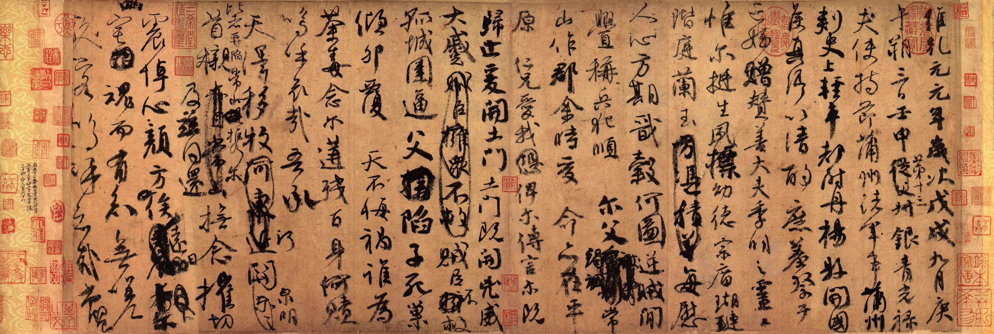
"Erasure
is an unacceptable mistake: If we do this, our work won’t be accepted or sold.
Ancient calligraphers did not care so much about erasing or covering a wrong character with a right one. They did this naturally and the work looked even more enlivened. While in our modern time, if any Chinese calligraphy stroke is covered with another one, the work will probably never win a contest or be sold. "Erasure" (or covering one stroke or character with another stroke or character) as shown in the following example is totally different from "amending or retouches" (repeating a stroke.) While a retouches or repeating a Chinese calligraphy stroke is considered a camouflage and dishonest, "erasure" is considered a change of content. ("Erasure" here does not mean to scratch off the strokes or characters to be changed.) "Erasure" does not violate the rule that the brush writing should come directly from one's mind and real skill. While an amended brush stroke can be easily told by experts because it shows evidences of inconsistent ink densities, "erasure" honestly tells the viewers that the "contents" of the calligraphy have been changed and they are not related to one's brush stroke skills. (In Chinese calligraphy contests, judges sometimes use magnifiers to look for inconsistent ink densities as evidences of retouches and get rid of those candidates.)
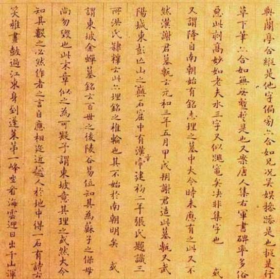
Preface to the Orchid Pavilion Collection (Lang Ting Prologue) is the most famous Chinese calligraphy work by Wang Xizhi. It contains more erasures than most other works! The erasures here are to change the content of the article, not to amend the calligraphy strokes. Amending strokes is not permissible for an honest calligrapher and anyone who practices Chinese calligraphy.
Another famous work full of "erasures" was written by Yen Jen-Chin in lamentation of his nephew being killed in a military riot. During writing this Eulogy for a Nephew, he was so sad about his nephew's death and had no intent to make it an artistic calligraphy work, and he even struck out thirty-four characters. However, this work is generally considered the "second best" cursive style calligraphy throughout the history of China! (Second only to Preface to the Orchid Pavilion Collection .) Viewers may feel his emotional intensity through his masculine, determined, agitated yet skillful brush strokes. While some beginners may think this work is full of mess and erasures and question why it is being collected in the National Palace of Museum in Taipei, the Chinese people look for the spirit and intrinsic substance over the extrinsic forms and neatness in a masterful work like this.